At Scouts Canada our mission is to develop well-rounded youth better prepared for success in the world. With every piece of communications, we strive to showcase this.
The Scouts Canada brand consists of many elements you are encouraged to use, that will establish an organizational identity that is consistent nation-wide. These elements include the brand colour palette, logo and tagline positioning, and fonts. Incorporating these elements into your communications pieces will showcase our mission and ensure your pieces are easily recognizable.
Brand Promise
Kids in Scouts have fun adventures discovering new things and experiences they wouldn’t have elsewhere. Along the way, kids develop into capable, confident and well-rounded individuals, better prepared for success in the world. Scouts is the start of something great.
Scouts Canada Logo
Our corporate logo is the hallmark of Canadian Scouting. It is our official seal, our signature, and its use indicates ownership, domain and accordance with our Mission, Principles and Practices.
It is essential that our logo be used correctly in all circumstances. The corporate logo should always be taken from the official files provided, using the official versions of the logo only. The elements within the logo and their relative position to one another cannot be rearranged.
Logo Guidelines
The logo and the logo with tagline are available in different formats to suit varying uses.
- The preferred usage is the Scouts Canada Logo as a photographic treatment on a white background.
- The preferred usage is to print four-colour process (cmyk).
- Use black ink only when two- or four-colour process is not available.
- This logo is to be used for all print advertising, stationary, and web applications.
Preferred Reproduction: Four-colour process.
If the four-colour process is not available, there are several acceptable variations.
Two-colour: Use the logo with Pantone 185U or Pantone 032C and Black when four-colour process is not available.
One-colour/Greyscale: Use the logo in Black when the use of colour is not available. In this variation of the logo, the leaf should always be 55% of black.
High Contrast Black & White: Use the logo with solid Black when colour or greyscale is not available. This variation of the logo should only be used for small applications—for example, engraving on glass or metal, making trinkets, etc.
Print Versions
Logo CMYK, format .tif
Logo Grayscale, format .jpg
Logo Pantone, format .eps
Logo B&W, format .eps
Web Versions
Logo RGB, with Tagline
Logo RGB, no Tagline
Logo RGB, Transparency, format .png
Logo RGB, Transparency, format .png
A few things to avoid
Protection Space and Minimum Size
Protection Space: In order for the logo to be easily seen and recognized as a clear piece of branding, it must not be crowded by other images or type. The general rule is to leave a space around the wordmark no less than the height of the “fleur-de-lis” within the maple leaf.
Minimum Size (0.75 inches): The logo must always be legible. In order for the logo to provide maximum impact, it should not appear smaller than the minimum size illustrated below (0.75 inches).
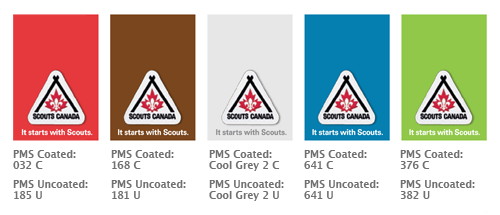
Colours
Note: The colours below are for reference only. Use official Pantone® swatches for colour matching.
CMYK & RGB Breakdowns:
PMS 032c
CMYK – C:0% M:100% Y:70% K:0%
RGB – R:237 G:41 B:57
PMS 185u
CMYK – C:0% M:100% Y:100% K:0%
RGB – R:237 G:41 B:57
Black
CMYK – C:0% M:0% Y:0% K:100%
RGB – R:0 G:0 B:0
Grey
CMYK – C:0% M:0% Y:0% K:55%
RGB – R:138 G:140 B:142
Official Colours
Scouts Canada Official Colours
An important and integral element in the brand identity program is a definite, specified, and consistent use of colour. It helps us build brand recognition and awareness for our organization. As reproduction of standard colours on different paper stocks and materials will result in variations of colour, every effort should be made to ensure that suppliers maintain colour uniformity. Colour reproduction should match the Pantone swatches identified below. The ink identification number is a guide for suppliers and may require adjustments to provide an acceptable visual match.
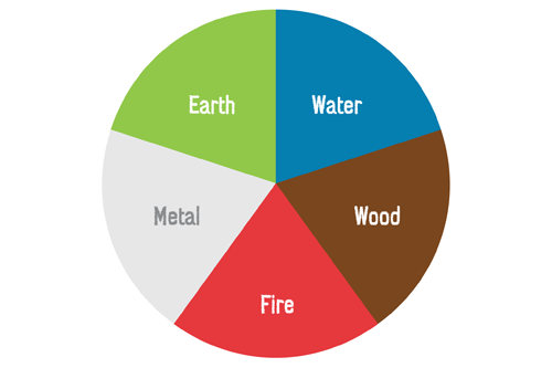
Colour Wheel — The Five Elements
The following colour scheme is based on the five elements. Red corresponds with fire, blue with water, grey with metal, brown with wood, and green with earth. The colours are naturally bright and cheerful with an organic look and feel.
Pantone Swatches
Typography
Scouts Canada Typography
Typography is a critical element of the visual identity. Using our brand typefaces consistently contributes to Scouting’s public recognition, and ensures our communications are dynamic, consistent and distinctive. If you don’t have a copy of either family please use Arial.
- Bliss
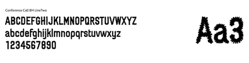
- Conference Call BH Line Two
Bliss
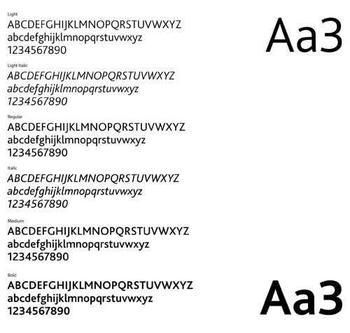
Visit the font licensing page for Bliss.